H-H-Hamburg
Typography in the City and Animation of Typography
Description
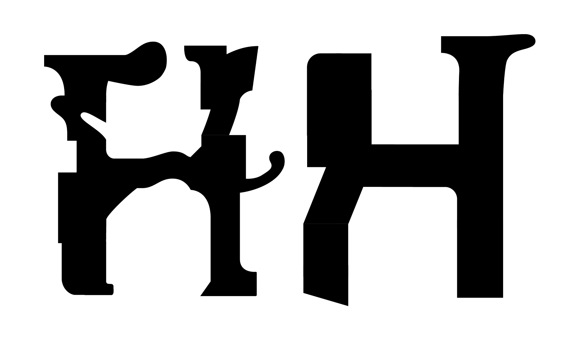
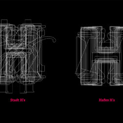
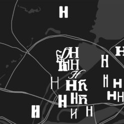
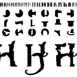
The work deals with the topic of "typography in the city", using Hamburg as an example. For this purpose, the city and harbor areas of Hamburg were compared in typographic terms. The process began with exploring the city on foot and discovering lettering on buildings. The lettering found could then be incorporated into the historical context of architecture and typography. 24 lettering styles that were particularly striking or significant were chosen from a selection of lettering found in both the port and the city. From those, the letter H was taken out and used to create two experimental letter designs. By combining many details of the collected H's, the letters represent the typographic style of the respective city area. In addition, two animations were created: one that showed how the two letters were put together, and another that demonstrated a metamorphosis between the H's.


